How NOT to do the Project
Example 1
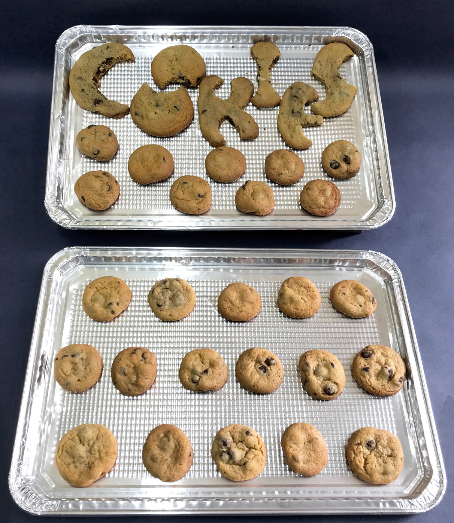
On this page you will find examples of student projects that are not successful. These projects suffered from low effort, illegibility, poor kerning, and lack of three dimensionality. "COOKIES" below is an example of all four of those flaws. The word itself is cramped in the confines of the pan so that the letters jog up and down in order to fit. The letters themselves attempt to look like cookies that have had bites taken out of them, but they were very clearly cut with a knife and appear low effort and arbitrary. The additional pan of cookies was a nice contribution since the class got to eat part of the project, but they should not have been included in the presentation since they cluttered things up and distracted from the word. If the scale of the letter-shaped-cookies matched the cookies that were not part of the word, it might have made more sense. However, overall the entire project lacked three dimensionality. The student who made this could have chosen gingerbread and made three dimensional letters constructed with royal icing instead of chocolate chip cookies.
Example 2
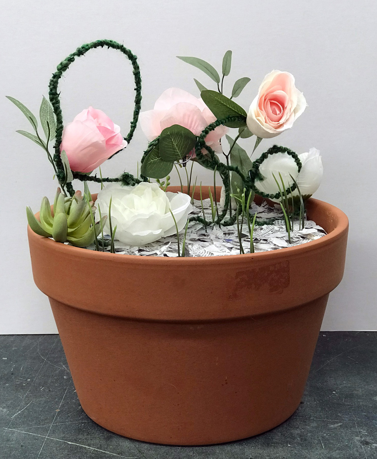
Look at the second project, in the terra cotta pot. Can you make out what it says? It is even harder to read when there is no solid background behind it. Sometimes being difficult to read is part of the meaning of the word, such as when a student in the past chose "CAMOUFLAGE." However, for the most part it is very important for your word to be completely legible. The example given above is meant to say "ROSE" and is made out of pipe cleaners and fake flowers with a plastic succulent and plastic grass which do not relate to the word and instead confuse matters further. Had the student instead used woven rose stems, and researched how to desiccate flowers in silica, the project could have been quite interesting. The cheapness of the materials made the word appear crafty and juvenile rather than thoughtful or refined. Perhaps a better word choice for this project would have been "KITSCHY" instead.
Example 3
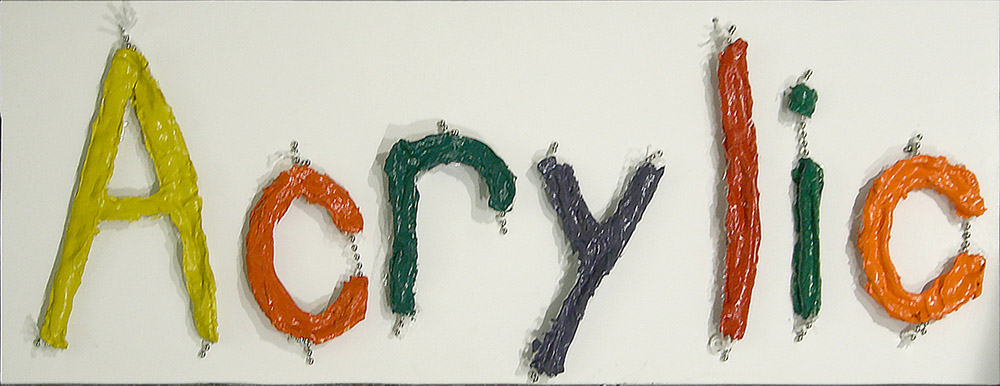
The piece above has some pretty serious issues regarding the concept, execution, presentation, and even the letterforms themselves. The kerning is poorly done. Why are ball chain sections protruding through the letters? Is there a better way to display the word? Thinking about it conceptually, what does the word "acrylic" evoke in you? Is it messy and hand-shaped, or is it precise and machined? It takes an investigation into what the medium actually is before it can be effectively used. In this case, the medium is acrylic paint, not acrylic sheet or chemically set cast acrylic. Perhaps a better word for the medium is "paint". However, the colors are solid, rather than blended, so they are not painterly; they are actually formed in crude letter-shaped molds and allowed to dry sufficiently to remove the solid objects, meaning they were not even painted. This piece offers no challenge to the viewer to discover something new, or to simply relish in the beauty of a form.
Example 4
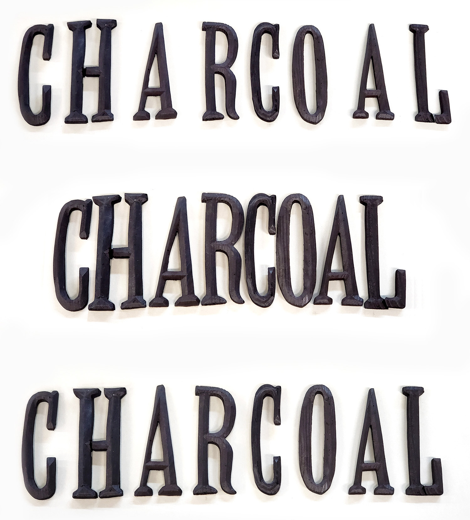
Now, this project is actually one that was highly successful, since the student put in a great deal of time and effort to hand carve their word out of wood in a serif font, then converted it to charcoal by burning it in a low oxygen environment. However, since it is not affixed to any base, it is very easy to alter the kerning. Letters like A tend to appear further away from other letters when things are spaced evenly, since the tilted angles of the sides create the illusion of greater distance between letters. In the second example, all of the letters are practically touching and the word is cramped and hard to read. The third example shows how the word should be presented, with letters that appear to have even spacing, although if you look at the base of the A's, you can see how close they actually are to their neighbors.
Example 5
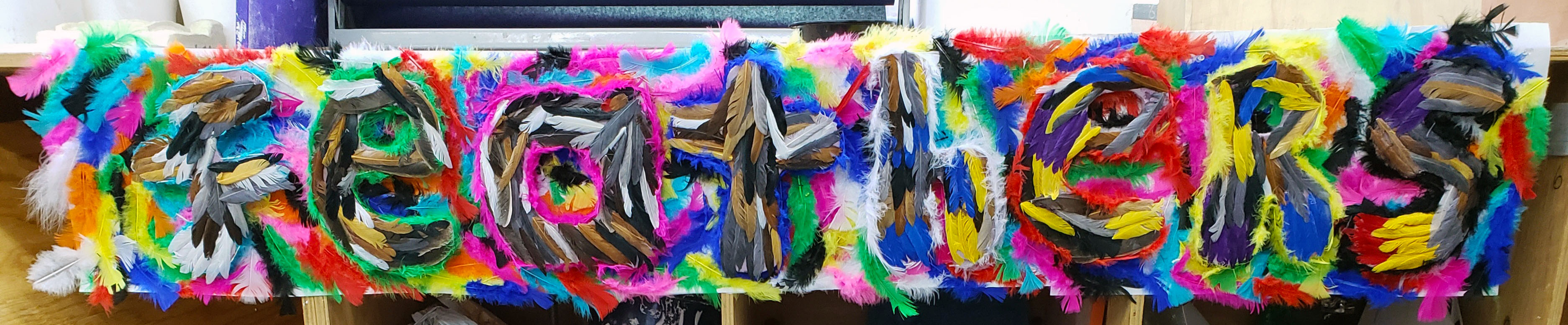
This last example falls flat on almost every aspect. It is nearly impossible to read, the font does not relate to the word at all (there is a random capitalized R for some reason), the word is barely three dimensional, the background of feathers is entirely unnecessary and obscures the actual word, the feathers are applied in a haphazard and arbitrary manner, the word choice is extremely literal, and the student willfully disregarded every attempt to discuss ways he could make the project more successful. Below is the feedback he received on his proposal, which the student entirely ignored.
- Your font choice feels rather arbitrary, and does not relate to your word. In addition to putting more thought into the shapes of your letters, I would recommend considering alternate words, like "WING," "PARROT," "BIRDS," or even "PARADISE." Parrot would give you more options as well, since it is both a noun and a verb.
- We discussed the fact that your feathers are all dyed to vibrant synthetic colors. You can tone down the colors, and over-dye them for a more cohesive look. If you chose to switch to "BIRDS" you could theme the colors of each letter to correspond to a particular species like a blue jay, yellow canary, red cardinal, green budgerigar, pink flamingo, multicolor macaw, etc. and tailor the shape of each letter to correspond with each specific bird species.
- At this point, you should spend some time experimenting with how to arrange the feathers, since they will inform how your word will be shaped. Rather than relying too heavily on hot glue, try looking up how milliners stitch feathers to buckram and the like.
Normally student feedback is much more open ended and less prescriptive, but after multiple conversations about this project in which the student seemed content to only put in the bare minimum, this feedback was an attempt to spark some inspiration.
